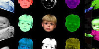
Inspired by Andy Warhol
In a Factory Cafe along the path heading toward the Dark Side of the Moon
23sep2008
© 2008 Robert Reese, All Rights Reserved.
Artists and designers the world over owe a huge debt to Andy Warhol's eccentric artistry. Who hasn't been encouraged to experiment in recreating one or more of his famous works of art such as Marilyn's multi-coloured headshots or his self-portrait? His ground-breaking use of basic colors have been a starting point for many experiments which ultimately lead artists into strange and unique territory.
What better way to celebrate COLOR than to give tribute to the person whom showed the world that color CAN be both the vehicle and the subject. What was avant-garde pop art yesteryear is now quaint passe today. The same holds true now and always going forward. And while I'm not a particularly big fan of Andy's art, (despite this pano, not really my style) I very much appreciate and am thankful for the influence he had and continues to have on the art world, and unknowingly the rest of the non-art world too.
So here is my gratitude (and my thanks to The Velvet Underground for influencing music I love) and a dedication to the memory of artists of all styles both past and future who blaze trails normal humans never would have imagined.
A mini-biography of Andy Warhol courtesy of the U.S. National Gallery of Art:
Andy Warhol's entry on Wikipedia:
The Velvet Underground's entry on Wikipedia:
Interview with TVU's John Cale on WNYC's Studio 360:
Artistica (non-photographic) / Panoramic Paintings
Lat: 32° 37' 40.44" N
Long: 84° 41' 24.6" W
Precision is: Low. Intentionally hazy, due to privacy concerns.
- Camera: Nikon D-70
- Lens: Nikon DX AF-S NIKKOR 18-70mm 1:3.5-4.5G ED
- Flash: Nikon SB-600 Speedlight
- Tripod: Manfrotto (Bogen) 055MF3 magfiber
- Head: Manfrotto (Bogen) Slidebar (for unused 3-D)
Software
- RAW Photo Editing: Bibble Pro 4.10a
- Photo Editing: Corel Paint Shop Pro Photo X2
- Pano Assembly: Pano2QTVR 1.6.6
- Audio Editing: Audacity 1.3.4-beta
- Audio Conversion: Apple QuickTime Pro 7.5.5
- Audio Conversion: QuickTime OGG Plug-in for OGG VORBIS
The cube faces are 1836 pixels square, which gave me nine 612 pixel squares per side for each of the horizontal faces. The top and bottom were reserved for spatial effects.
Since the shots were not taken with a fisheye lens there was no need to to defish or unwarp the images. Instead, all I had to do was to create the cube faces using a standard photo editor, saving each as cube_1,cube_2,and so forth.
Once the faces were complete, I simply used Pano2QTVR to create a cube-based panorama!
There is a slight difference betwee the small and full-size versions as a special "extra" to those few daring individuals that choose to view it fullscreen.
The song itself is about Warhol. Andy essentially gave The Velvet Underground their big break, and while the honeymoon was fairly short at least Andy Warhol and TVU did, at the time, create an era-defining multimedia show called Exploding Plastic Inevitable.
Ironically, I found this song well AFTER the pano was completed. Same goes for the interview page where, interestingly, Mr. Cale's photo is eerily similar to mine at the bottom of the pano - in fact, I had wanted to do a kaleidoscope style of photo but experimenting lead me to use a Prisoner inspired side. See http://www.imdb.com/title/tt0061287/ for more information on the Prisoner (which aired during the same era).
The intents of each side were initially different, and in some cases extremely different. That's the beauty of experimentation, however. Often, playing with extreme settings will reveal a particularly interesting treatment. And these were no different.
The primary face, or side, is of my son's disembodied head with an odd look upon his face. I'll leave the color usage as an exercise for you, dear reader. Get used to it with this entry.
Clockwise you encounter the tiled appearance of my daughter with a Marilyn-style treatment. The juxtaposition of the obviously computer-generated treatment and Warhol's basic pastel treatment of Marilyn was the deciding factor to keep me from trying to emulate Marilyn's portrait any further.
Continuing clockwise, you again find my daughter, only this time the entire photo is a single channel (at least based on one). The color usage here is obvious.
The final horizontal side or face is a photo of my children together. In this case I chose to simulate various available photographic techniques from over the past 180 or so years, including infrared. The "Time Machine" function of Corel's Paint Shop Pro Photo X2 made this a snap to build while giving a nostalgic look to the pano.
Above is an almost-pyramid shape with a son keeping an eye on things and shining his light on the scene, with elements drawn from psychedelic images so prevalent in the late 60's as well as the 'big brother' theme as found on the back of a dollar bill.
On the bottom is my strange attempt at emulating the almost Nick Nolte-esque photo nature that was Andy's self-portrait. Mine was supposed to be anaglyph, though, but I forgot to take the parallax photo. Go figure. So I opted for a different type of 3-D depth effect. Now it looks the cross between Andy Warhol's famous 1986 self-portrait and John Cale's photo on the WNYC page. (See my 'bizarre music' text).
Anyway, I hope my eclectic entry at least makes you stop and go "huh...".
Cheers, Robert~


 Tap or click the zoom icon in the bottom right corner of the picture to switch between in-page and fullscreen view